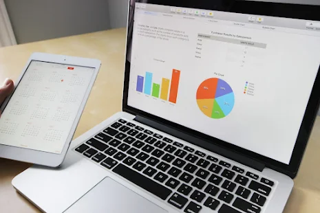
Data visualization comes in very handy if you want to tell a great story to your target audience through the use of visuals even though not all the visuals you incorporate in your business data will attract the attention of prospects on the internet. Getting that attention is where your creativity comes in to help engage your audience better through data visualization.
You can better enhance your engagement when presenting different types of visuals to your audience through the following techniques.
Choose the Right Type of Data Visualization
Experience shows that when presenting your marketing materials using visuals, one type is usually not enough to meet all your marketing needs. For this reason, you need to choose the right format that will suit all the visualizations. Sometimes, to make your message better understood, you may be compelled to combine charts to bring out the deeper meaning of the data you are presenting. Here is how it works.
When comparing different categories within one measure, it is best to use bar-charts. If you want to connect different unique points and present them as a single entity, your best choice is a line-graph. You can use pie-charts when adding details to other types of data visualization.
Use Predictable Patterns and Layout
Human beings by nature are visual creatures due to how they process data through their eyes and their brains. Human eyes play a vital role in helping to deliver lots of information to the brain even at a quick glance. Next is to engage the human brain to correctly seek random patterns within the given data sets the eyes are seeing. This is why when the patterns displayed in any data are not random, it becomes hugely challenging for the human mind to understand the information so delivered. Therefore, if you want your target audience to easily understand the information you are putting out, you must consider applying predictable patterns and a layout they can easily comprehend. If you use a sequential method to deliver your message, it is so much better for your target audience to understand and comprehend. So, anytime you choose to use different graphs in your visualization, ensure that they are in a consistent order and offer a clear connection between different data points. Your target audience understands and connects with the marketing info better that way.

Use Text Carefully but Intentionally
By nature, the human brain can easily translate patterns and images faster than words. This is why the type of text you use in your messages can either help to improve the visualization or ruin it altogether. Crowding the entire message with bogus texts helps to ruin its visualization as well. Using text carefully but intentionally is the key to good results. Your focus should always be on applying text where it matters most and with adequate care to avoid crowding. If the text is used only to point to specific and important details about the visuals, so much the better. Positioning the text also matters a great deal. Because the human eyes are naturally drawn to the top left or right corner on the upper side of documents, it is safer to ensure you position the important view on either of these areas. This is because the human eyes are easily drawn to these areas even at a fleeting glance. This is the reason interactivity is better enhanced in this way. If you enhance interactivity in visualization, it eliminates confusing elements within the visualization. That helps to present the desired goal in a concise and more precise manner for good effects.
Use Clear Colors to Convey Your Message
It is difficult to talk about data visualization without talking colors. This is because the color you apply to visuals usually conveys a more vivid and significant message when compared to the written text. However, there is a delicate balance when it comes to balancing colors though. What you really need colors for is to use them to highlight your text messages. Excessive use of colors is however not advisable to avoid confusing and even distracting your target audience. It is best to apply initiative colors that are sensible and align well with your message. If the colors are attractive and make more sense to the target audience, they help to make it easy for them to process your data when reading through the displayed visuals. You must therefore endeavor to maintain color consistency at all times because the way you use colors in your texts directly affects the message you intend to convey to your target audience.

